Separating the noise from the signal is the bane of modern investment analytics. An excess of opinion and data confound and complicate our capacity to focus on the key decisions for designing and managing investment portfolios. One of my favorite tools for cutting through the clutter is a graphical tool known as boxplots. If I could only choose one charting methodology for analyzing performance data, I’d go with boxplots. Here’s why.
Let’s say you’re managing a portfolio that’s comprised of the major asset classes via a set of ETFs to represent the various markets. One possibility might look like this
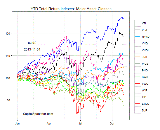
One way to review performance is by comparing the ETFs in relative terms. For instance, here’s how the returns stack up so far this year after rebasing all the ETFs to 100 at the close of 2012:

This chart above provides a quick summary of returns, but it’s not all that useful for making decisions. Boxplots offer a better way to analyze the performance data. For example, here’s how the ETF list compares in terms of the range of rolling 1-year returns, including the current 1-year percentage change through yesterday, November 4 (indicated by the red dot).
For those who are unfamiliar with boxplots, here’s what the chart above is telling us. The rectangles show the core set of historical returns–the range of returns (in this case 1-year performance data) from the first to the third quartiles (or the 25th to 75th percentiles, if you prefer). The horizontal line inside the rectangles is the median return. The vertical lines that extend from the top and bottom of the rectangles, up to the “whiskers” (the horizontal lines), reflect the returns above and beyond the interquartile range (IQR), i.e., returns that fall between the first and third performance quartiles, as shown by the rectangles. To be precise, the vertical lines above and below the rectangles, up to the whiskers, are the returns that are calculated as beyond the IQR up to 1.5 times the outer edges of the IQR returns. The black dots at the outer reaches, beyond the whiskers, are the so-called outliers. (Note that some ETFs don’t have outliers, based on the sample data in this example.) The red dots show the latest performance numbers.
The value in looking at boxplots is that we have a visual aid that quickly and efficiently summarizes the performance data across a spectrum of assets. In one graph we can easily review the return distributions and identify those asset classes that appear to be overvalued or undervalued in terms of their current performance record vs. history. We can also see when the returns are currently within their “normal” ranges, as shown by the red dots inside the rectangles.
In some cases, the current return looks extreme. The implication is that the rebalancing possibilities look relatively compelling with extreme returns. At the very least, the instances of returns that currently fall outside the “normal” range alerts us to take a closer look at the asset class as a possible rebalancing candidate. Yes, all the usual caveats apply. There’s no law that says an extreme return can’t remain extreme for an extended period, or even become more extreme. But at some point reversion to the mean kicks in, as numerous studies through the years demonstrate. This aspect of market behavior is especially relevant through time and across a broad set of assets, even if there are exceptions in the short run.
Meanwhile, don’t forget that you’ll get different results depending on your preferences on asset class definitions and the historical performance window to analyze. Keep in mind too that the historical record on ETFs varies quite a bit and so it’s not always possible to generate an apples-to-apples comparison. For example, the data for the iShares Global ex-US$ High Yield Corp Bond ETF (HYXU) in the boxplot above is limited, based on the fund’s start date in April 2012.
Nonetheless, boxplots offer a powerful tool for comparing and contrasting assets in the all-important business of analyzing rebalancing opportunities. Looking at data in this format on a regular basis dispenses a powerful dose of market intelligence with minimal effort. Should you rely exclusively on boxplots that use performance data? No, of course not. As usual in money management, a variety of perspectives and techniques is crucial. We could, for instance, look at volatility histories with boxplots for a portfolio-wide review of historical risk.
Yes, the sky’s the limit when it comes to the possibilities for portfolio analytics in the 21st century. But if you’re wondering where you might start, boxplots are on my short list these days. (You can create boxplots in Excel, but the computations are much easier in R, the statistical software environment. In the example above, I used the ggplot2 package to create the boxplots.)
Finally, I’ll soon be adding boxplots to The ETF Asset Class Performance Review and so subscribers can expect to see this feature on a regular basis in upcoming issues.