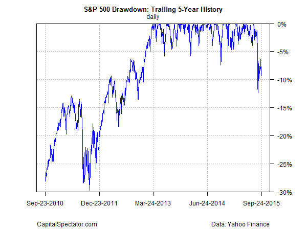
Avoiding a hefty drawdown is a high priority for every investment strategy, but monitoring the history of decline from previous peaks is a valuable indicator for deciding if a given market has crossed the Rubicon into bear-market territory. Minds will differ at the moment on the subject of US equities, in part because the S&P 500’s one-year loss is a relatively mild 3.3% slide as of Sep. 24. But drawdown data is painting a darker profile for the US stock market.
As usual, the value of any one indicator in the dark art of divining the future path of the stock market (or any other market, for that matter) is open for debate. The one thing that’s beyond debate is the reality that no market metric is flawless. But as quantitative analysis goes, drawdown has proven to be a relatively robust metric, which is why it’s one of ten indicators for calculating the Crash Risk Index.
It’s also useful to review how indicators perform in isolation. On that note, it’s not terribly surprising at this point to learn that drawdown’s message for the S&P 500 isn’t encouraging. As of yesterday’s close (Sep. 24), the S&P 500’s drawdown ticked lower, slipping to -9.3%. That’s moderately higher than last month’s -12.3% (Aug. 25), which marks the deepest cut since 2012, but it’s clear that a bearish aura is weighing on the market these days.
For deeper perspective, let’s consider a longer history, stretching back to 1960. As the next chart shows, drawdowns in the 10%-to-20% range are usually linked with heavy and sustained losses–full-out bear markets. The fall from grace was especially deep during the last recession, when the S&P’s drawdown touched an all-time low of nearly -57% in late-November 2008. Well before that point–throughout 2007–the S&P 500’s drawdown tested the -10% mark several times. The dam broke in Jan. 2008, when drawdown slipped decisively below -10%, which turned out to be an early warning of the subsequent chaos (including steep losses for the S&P) that followed.
The current drawdown of -9.3% is mild by comparison. Previous slides to the -10% zone have turned out to be little more than a temporary wobble… sometimes. The question is whether the red ink at the moment is a prelude to an extended decline? No one really knows at this point, although it’s clear that the case for and against a dark outlook for the stock market is precariously balanced.
If stocks continue to slide and drawdown sinks well below the -10% level, the odds will climb that we’ll see an even deeper rout. According to some market metrics, the jig is already up, as I noted yesterday. In any case, the margin of comfort is razor thin overall. Drawdown, meanwhile, is on the fence in terms of issuing a genuinely dark signal. But in the wake of the market’s recent slide, drawdown is close to what appears to be a tipping point. In short, the next few weeks (days?) could be decisive, for good or ill.
The good news is that the broad macro trend for the US is still positive through August, as discussed in last week’s monthly profile of business cycle risk and confirmed in yesterday’s release of the Chicago Fed National Activity Index. That’s a potent factor for expecting the market to stabilize and perhaps move higher in the near-term future. But economic data arrives with a lag. The burning question: How does September’s macro profile compare? The answer is arriving in the usual way: one economic update at a time.


Pingback: News Worth Reading: October 2, 2015 | Eqira
Pingback: Could the market go from bad to worse? | WRITE ON THE MONEY