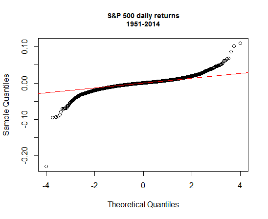
The real-world challenges of dealing with fat tails—the higher frequency of extreme returns than a normal distribution implies—have received a lot of attention since the market crashed in 2008, and rightly so. Modeling asset prices based on an assumption of normally distributed performance runs into trouble when Mr. Market throws a hissy fit. As a result, a lot of models crashed and burned during the Great Meltdown in late-2008. We’re all older and presumably wiser now. But while it’s tempting in the post-crash era to allow non-normal distribution modeling to dominate portfolio analysis and design, reality is a bit more nuanced.
As an example, consider the US stock market (S&P 500), which exhibits fat-tail behavior in no uncertain terms. Actually, that’s old news. Research since at least the 1960s has told us as much. The fact that the crowd “discovered” this ancient bit of knowledge post-2008 is curious, although not entirely surprising. But that’s another story. In any case, the current discussion about fat tails these days tends to start and end there for some folks. But there’s more to the story, namely: the existence of what economists call temporal aggregation. In plain English, this means that converting high frequency returns (daily) to lower frequencies (weekly, monthly, annual, etc.) pushes the return distribution closer to normality. Returns are still non-normal at, say, an annual frequency, but less so compared with daily returns.
To illustrate the phenomenon, consider the S&P’s daily percentage returns in terms of quantiles, which divides the performance record into equal-sized portions. The graph below plots the sample return of the S&P (black circles) against the theoretical quantiles (red line), defined here by a random distribution. If the S&P’s daily returns were perfectly random, the black circles would match the red line. Clearly, that isn’t the case. In the lower left-hand corner of the chart, for instance, the black circles are well below the red lines—the smoking guns for identifying fat tails in the distribution. (The lone circle in the lower left-hand corner, by the way, reflects the unusually steep one-day loss of nearly 23% on October 17, 1987–the fattest of the fat tails on the red side of the performance aisle.)
Let’s run the same analysis with annual returns for the S&P. In the next chart, it’s obvious that the S&P’s returns still fall short of normality, but the gap is smaller—i.e., the black circles exhibit fewer and lesser divergences from the red line.
What can we do this information? One lesson is that the shorter your investment horizon, the more likely that your results will be subject to a non-normal distribution. The flip side is that as your time horizon lengthens, returns will move closer to approximating a normal distribution.
The practical message is that beating the market becomes tougher over longer periods. If returns are more likely to be normal through time, the anomalies that prevail in the shorter run are less likely to provide us with aid and support in the pursuit of alpha (market-beating results) across a span of years. If you’re investing for, say, retirement in 20 years, you probably should give more weight to a normal distribution for modeling return projections. The fat-tail factor should still play a role, but less so vs. modeling a short-term strategy for, say, tactical asset allocation. Recognizing this nuance may have influenced last week’s decision by Calpers, a pension fund with a long-run horizon, to terminate its allocation to hedge funds.
The bottom line: normal distributions are still useful for analyzing markets and designing portfolios. Indeed, even in the daily return plot above it’s clear that the distribution looks quite normal for a fair amount of the sample. We can’t rely on normality alone for modeling markets. Factoring in fat-tails risk is essential. But letting a fat-tail worldview dominate your analysis is every bit as flawed as assuming that normal distributions will prevail. Asset pricing doesn’t neatly fit into one theoretical box, which means that our analytical tool kit shouldn’t be in a conceptual straightjacket either.
Note: the charts above were created in R. Here’s the code to replicate the graphs:
library(tseries)
library(stats)
library(xts)
library(TTR)

sp500 <-get.hist.quote(instrument="^GSPC",start="1950-12-31",quote="AdjClose",compression="d")
sp500.1 <-as.xts(na.omit(ROC(sp500)))

sp500.y <-as.xts(to.yearly(sp500,OHLC=FALSE))
sp500.y.1 <-as.xts(na.omit(ROC(sp500.y)))

qqnorm(sp500.1,
       main="S&P 500 daily returns\n1951-2014",
       cex.main=0.9)
qqline(sp500.1,col="red",distribution=qnorm)

qqnorm(sp500.y.1,
       main="S&P 500 annual returns\n1952-2014",
       cex.main=0.9)
qqline(sp500.y.1,col="red",distribution=qnorm)


What library or code did you use for the ROC function? I don’t seem to have it.
Pingback: The Whole Street’s Daily Wrap for 9/25/2014 | The Whole Street
Nick,
I accidentally left out the packages to load. See the corrected code for an answer to your question. Specifically, the TTR package contains the ROC() function.
–JP
Pingback: Reality = Normal + Fat-Tail Distributions | Abnormal Capitalist