So much for pessimism. Most of the key economic reports for March are in and the general message looks encouraging… again. You can never say anything definitive about the business cycle in real time, but the data in hand today strongly suggest that the recent turbulence in some economic reports was only a temporary blip in an ongoing run of moderate growth.
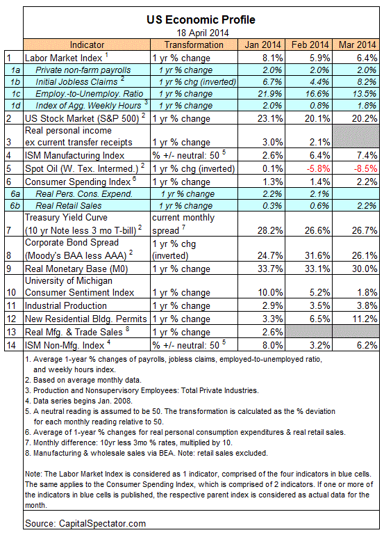
The March update of a diversified set of 14 economic and financial data sets for the US certainly looks encouraging. Indeed, the Economic Trend and Momentum indices (ETI and EMI, respectively) remain at levels that equate with expansion. In addition, the estimates for the next several months imply that we’ll see growth continue for the near term. This upbeat news can change, of course, depending on what we see in the April numbers, which will start arriving in a couple of weeks. But using the primary signal from the nearly complete profile for March, recession risk is a low-probability event, as it has been all along.
As always, it’s best to let the numbers do the talking. As I explain in Nowcasting The Business Cycle, the diversified data set below paints a valuable approximation of economic activity. By this measure, the broad trend remained positive through last month. Despite all the worries of late, business cycle risk has been low based on a broad set of numbers that are measured in an econometrically meaningful way.
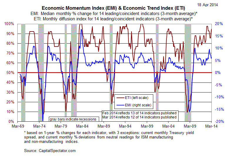
For another perspective on the big-picture trend, consider the historical record for the composite measure of the 14 indicators in the table above via ETI and EMI (see chart below for definitions). Both metrics remain well above their respective danger zones: 50% for ETI and 0% for EMI. If and when the indexes fall below those tipping points, we’ll have clear warnings signs that recession risk is elevated. For now, there’s still a healthy margin between current values (94.7% for ETI and 6.2% for EMI) and the danger zones.
Translating ETI’s historical values into recession-risk probabilities via a probit model also suggests that business cycle risk is non-event at the moment.
Now let’s consider how ETI’s values may evolve as new data is published in the near future via projections for the index with an econometric technique known as an autoregressive integrated moving average (ARIMA) model. (The calculations are generated in the “forecast” package for R, a statistical software environment.) The ARIMA model estimates the missing data points for each indicator, for each month, through May 2014. (January 2014 is currently the latest month with a complete set of published data). Based on today’s projections, ETI is expected to remain well above its danger zone for the immediate future.
Forecasts are always suspect, of course, but recent projections of ETI for the near-term have proven to be relatively reliable guesstimates vs. the full set of monthly reported numbers that followed. That’s not surprising, given the broadly diversified nature of ETI. Predicting individual components, by contrast, is prone to far more uncertainty in the short run. As such, the latest ETI projections (the four light-blue bars on the right in the chart below) offer support for cautious optimism. For comparison, the chart also includes the vintage ARIMA projections published on these pages in previous months, which you can compare with the complete monthly sets of actual data that followed, based on current numbers (red circles). The assumption here is that while any one forecast for a given indicator is likely to be wrong, the errors may cancel one another out to some degree by aggregating a broad set of predictions.
For additional perspective on judging the value of the forecasts based on the historical record, here are the updates for the last three months:


Pingback: Manufacturing Employment Signals Economic Growth
Pingback: Will The Weak Housing Market Pinch The Economy?
Pingback: ADP: Payrolls Perk Up Again In April