Whenever breathless headlines shout danger and destruction for the stock market, my first reaction is to fire up R to update the perspective on the performance trend. After yesterday’s sharp correction in the S&P 500, which extends the recent downturn and leaves the index at a one-month low, it’s time again for a reality check if only to keep behavioral risk from running amuck.
There are many ways to focus on signal and minimize noise when assessing market activity, but I like to begin with the rolling one-year return. It’s far from the last word on risk and return analytics, but it’s a great place to start because it filters out a lot of the short-term noise while at the same time reflecting the lion’s share of return volatility that moves prices through time.
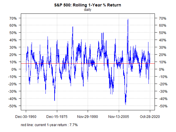
The first chart below shows how the S&P’s rolling one-year return stacks up relative to recent history (since 2015). The main takeaway: the current 7.7% one-year gain is middling. Although there’s a wide range of results through time, the current performance is in line with long-term performance.
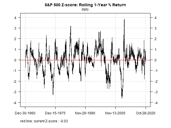
Does the perspective change when we look back over the past 60 years? No. Rather, it’s more of the same. The current 7.7% increase over the trailing 252 trading days is more or less what you’d expect to see most of the time.
Another way to visualize one-year returns is by looking at results through the prism of the distribution. As the next chart shows, the current one-year gain is radically normal for results since 1960.

For one last bit of perspective, consider rolling one-year returns from the perspective of Z-scores, which measure how far data varies from its mean. Basic statistics tells us that for a normal distribution data points will vary by 2 standard deviations from the mean 95% of the time and variation will fall within 3 standard deviations in 99.7% of the observed results. Stock returns aren’t normally distributed and so this lens is only a starting point for analysis, but it’s useful for some quick, initial perspective. With that in mind, the chart below reaffirms what we saw above: the current one-year performance is a bit of a yawn.

The key message is that there’s nothing particularly unusual about the latest one-year change in the S&P. You must forgive the usual suspects for overlooking this reality since it’s quite boring as equity market stories go. But don’t worry: far more dramatic results are coming, as the chart above remind. The only mystery is with timing.
Learn To Use R For Portfolio Analysis
Quantitative Investment Portfolio Analytics In R:
An Introduction To R For Modeling Portfolio Risk and Return
By James Picerno


Pingback: Updating the Perspective on the Performance Trend - TradingGods.net