Risk comes in many forms in the money game, but perhaps the first one on every investor’s list is the risk of experiencing extreme losses. This year has been a real-world case study on that front and so it’s timely to revisit the subject of modeling, forecasting and otherwise studying a subject that resonates far and wide for portfolio management, namely: profiling fat tails in return distributions.
To do justice to the topic is a multi-faceted project and in this introductory post I’ll lay out the preliminaries. In future articles I’ll go deeper and expand the horizon for assets, time periods and analytical techniques. Meantime, let’s start at the beginning with a question: What’s a fat-tailed distribution?
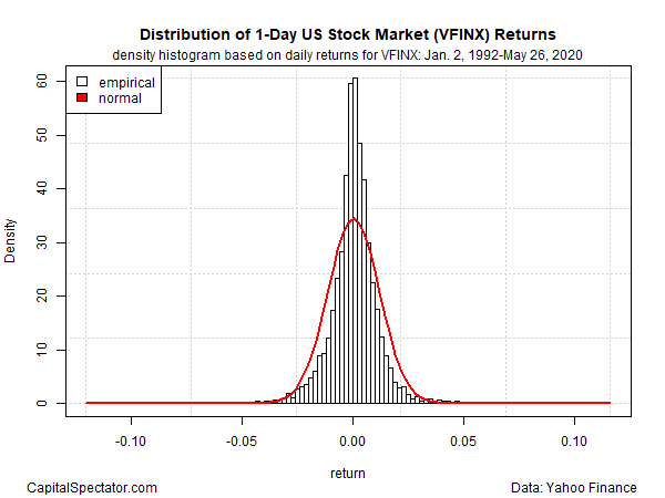
To answer, let’s use a couple of graphics to illustrate the concept. Consider the US stock market’s 1-day return profile via Vanguard 500 Index Fund (VFINX), a mutual fund that tracks the S&P 500 Index. Profiling the daily return distribution since 1992 through yesterday’s close (May 26, 2020) dispenses the following:

The bars reflect the range of actual returns, which can be compared with the normal distribution (red line). It’s clear that the stock market’s returns aren’t normally distributed. For example, the frequency of returns that cluster around zero are substantially higher vs. what’s expected for a normal distribution.
Learn To Use R For Portfolio Analysis
Quantitative Investment Portfolio Analytics In R:
An Introduction To R For Modeling Portfolio Risk and Return
By James Picerno
Although it’s hard to see in the graph above, the empirical returns for VFINX also violate the normal distribution at the extremes. For visual convenience, let’s zoom in on the far left side of the tail, which provides a snapshot of what’s going on in the outermost reaches of negative results.

It’s clear that there are more cases of extreme negative returns than expected with a normal distribution. In other words, the left tail results are fatter than normality predicts. If a normal distribution prevailed, the deepest daily loss would be roughly -5% at worst and the frequency of such losses would be highly unusual, perhaps occurring once or twice over many decades.
Reality, by contrast, is considerably different. Not only do extreme losses arrive more often than expected, the depth of the losses is also deeper than anticipated. In the sample period we’re looking at, VFINX’s daily declines have been nearly -12%. Note, too, that lesser but still relatively hefty losses show up in the historical record.
Modeling the stock market’s return distribution is fairly common these days and so few investors will be surprised at the results above. But this is just the tip of the iceberg. How do 1-year, 5-year and 10-year returns compare? Similar questions should be explored for multi-asset class portfolios. And what should we expect for other asset classes and economic indicators? Another key question: how can we forecast extreme results? Looking at the historical record is a useful first step, but since extreme returns are, by definition, relatively infrequent, simulating the possibilities is necessary to develop a complete picture of what the future may bring.
In future posts I’ll explore these issues. Meantime, email me if you have a specific fat-tails question you’d like to see discussed in this series.
How is recession risk evolving? Monitor the outlook with a subscription to:
The US Business Cycle Risk Report
Pingback: Risk of Experiencing Extreme Losses - TradingGods.net
Pingback: This Week’s Best Investing Articles, Research, Podcasts 5/29/2020 - Stock Screener - The Acquirer's Multiple®
Pingback: Profiling Extreme Returns - TradingGods.net